Build PDFs with JavaScript components and JSX
Compose a PDF from reusable functions, typed props, children, arrays and conditions. Use ordinary JavaScript without a build step, or write the same template in JSX/TSX. Pass the document to a Node renderer, render queue or browser renderer; you do not need to write HTML strings or install React.
The complete workflow uses fullbleed 0.6.0, wrapping engine 2.5.24.
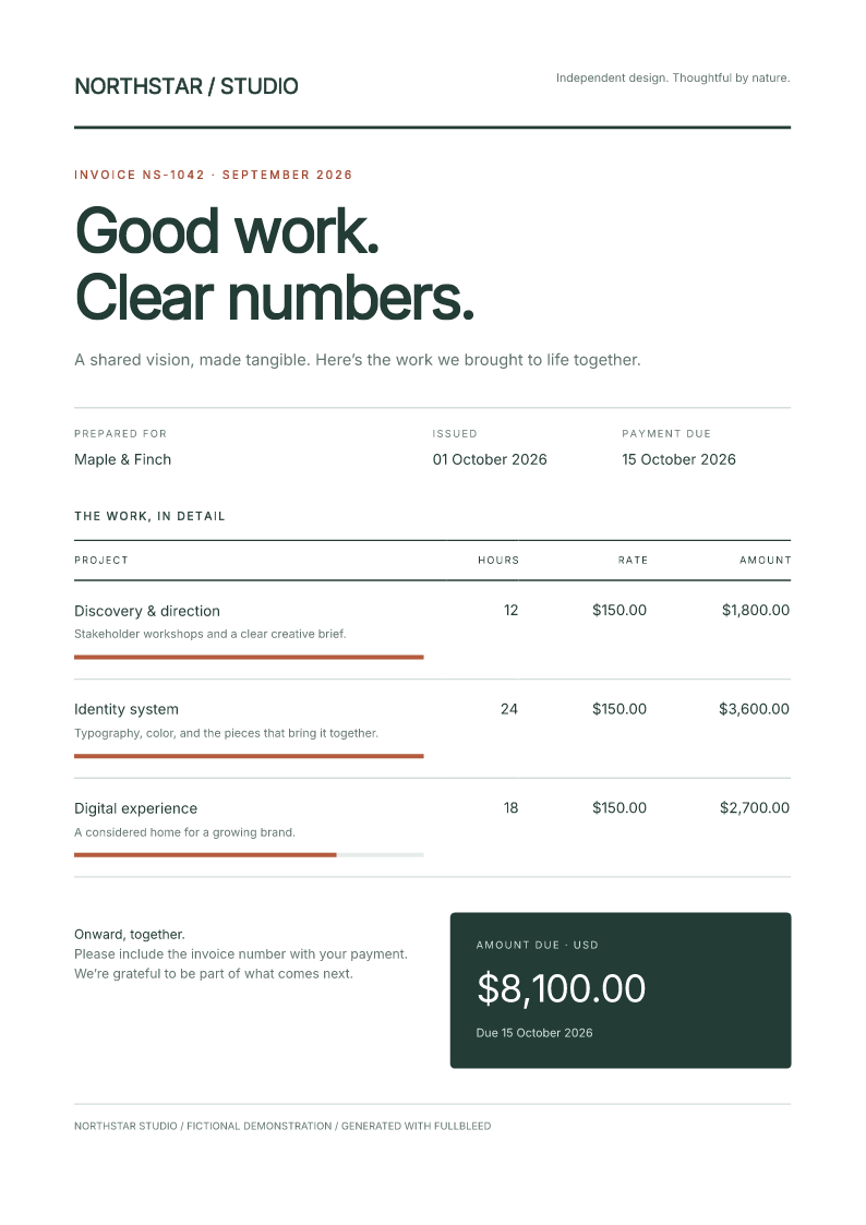
Try the component invoice in React
Download the complete project Open the component invoice
Prefer Python? Use the Python component workflow.
JavaScript without a build step
import { writeFile } from 'node:fs/promises';
import { renderPdf } from 'fullbleed';
import { Document, Heading, Paragraph, Strong, Stack, StyleSheet } from 'fullbleed/ui';

const Line = ({ label, amount }) => Paragraph(Strong(label), ': ', amount);
const styles = new StyleSheet({
  '@page': { size: 'A4', margin: '18mm' },
  body: { fontFamily: 'Inter', color: '#233c36' },
  h1: { fontSize: '32pt', letterSpacing: '-1pt' },
  p: { margin: 0 },
});
const Invoice = ({ customer, items }) => Document({ title: 'Invoice', styles },
  Stack({ gap: '12pt' }, Heading({ level: 1 }, 'Made for ', customer),
    items.map(item => Line(item))));

const invoice = Invoice({ customer: 'Maple & Finch', items: [
  { label: 'Design', amount: '$120.00' },
  { label: 'Review', amount: '$40.00' },
] });
const result = await invoice.renderPdf(renderPdf, { previewDpi: 96 });
await writeFile('invoice.pdf', result.pdf);
await writeFile('invoice.png', result.previews[0]);
Save this as invoice.mjs, install fullbleed@0.6.0, and run node invoice.mjs
with Node 22 or newer. Functions need no special wrapper. The optional
component(fn) identity helper preserves the function and its types.
Optional JSX and TSX
Use your compiler's automatic JSX transform. In a dedicated print-document file,
add /** @jsxImportSource fullbleed/ui */; this selects Fullbleed for that file
without changing the JSX runtime used by the rest of an existing app.
/** @jsxImportSource fullbleed/ui */
import { Document, Heading, Paragraph, Strong, Stack, renderDocument } from 'fullbleed/ui';
import { renderPdf } from 'fullbleed';

function Line({ label, amount }: { label: string; amount: string }) {
  return <Paragraph><Strong>{label}</Strong>: {amount}</Paragraph>;
}
function Invoice({ customer }: { customer: string }) {
  return <Document title="Invoice" styles={{ '@page': { size: 'A4', margin: '18mm' } }}>
    <Stack gap="12pt">
      <Heading level={1}>Made for {customer}</Heading>
      <Line label="Design" amount="$120.00" />
    </Stack>
  </Document>;
}
const result = await renderDocument(<Invoice customer="Maple & Finch" />, renderPdf, { previewDpi: 96 });
// result.pdf and result.previews[0] are Node Buffers; save or return them.
For a whole document project, TypeScript options are "jsx": "react-jsx" and
"jsxImportSource": "fullbleed/ui". Development JSX (react-jsxdev) and
CommonJS are supported. The React starter connects a composed
document to a live preview and configures Vite so print TSX and style edits
refresh the PDF. JSX expressions use renderDocument because their
TypeScript type can represent a document, element, fragment or text.
This is React-inspired synchronous composition for print output. React hooks,
events, refs, React component libraries and async components are not supported.
Fetch data before composing the document. key is accepted and ignored because
static documents have no reconciliation lifecycle. Native tags remain available
for engine-supported markup; their presence is not a claim of browser layout support.
Props and children
Paragraph({ className: 'note' }, 'Hello ', Strong('world')) accepts props first.
Paragraph('Hello ', Strong('world')) is shorthand when there are no props.
Paragraph({ children: 'Hello' }) also works; combining props.children with
positional children throws rather than silently losing content.
Nested arrays and ordered iterables are captured at construction. false,
true, null and undefined omit children; numeric zero remains. Format booleans
and data objects explicitly. Maps, sets, buffers, promises, uncalled functions,
cycles and nested documents fail clearly. Use one outer Document.
Text and attributes are escaped. A string containing <strong> prints literally;
use Strong for emphasis. Elements snapshot their children, attributes and inline
styles. StyleSheet snapshots rule maps and composed styles, so later mutations
do not change an already-authored document. Developer-authored CSS and URLs are
not sanitized for untrusted template execution.
Named components
| Purpose | Components |
|---|---|
| Text | Text, Paragraph, Strong, Emphasis, Heading, LineBreak |
| Structure | Document, Fragment, Box, Header, Footer, Section |
| Layout | Stack, Row, LayoutGrid, Inline, Center, Card, Divider |
| Tables | Table, TableCaption, THead, TBody, TFoot, Tr, Th, Td |
| Lists and media | List, ListItem, Image, Link |
Heading accepts integer level 1–6. Section can prepend a heading with a
headingLevel. Image requires src and an explicit alt string; use alt: ''
for a decorative image. Link requires href. Table headers accept scope.
These helpers do not port Python's semantic validator or establish PDF/UA conformance.
Layout containers accept a constrained semantic as tag, such as
Stack({ as: 'section' }, ...). List({ as: 'ol' }, ...) creates an ordered list.
el(tag, props, ...children) remains the lower-level escape hatch.
Class names and styles
className labels an element so stylesheet selectors can match it. It does not
create or load a style. Define the rules in a StyleSheet and pass that sheet
to the outer Document through its styles prop.
| Prop | What it accepts | Where it applies |
|---|---|---|
className="notice is-paid" |
Space-separated class names, without dots | The element returned by a built-in component |
style={{ color: '#a64232' }} |
Inline declarations, without a selector | That element |
<Document styles={sheet}> |
A stylesheet containing selectors and declarations | Matching elements throughout this document |
This example prints Paid in full in blue at 18 pt:
/** @jsxImportSource fullbleed/ui */
import { Document, Paragraph, StyleSheet } from 'fullbleed/ui';

const paymentStyles = new StyleSheet({
  '@page': { size: 'A5', margin: '15mm' },
  body: { fontFamily: 'Inter' },
  '.notice': { color: '#245541', fontSize: '18pt', margin: 0 },
  '.notice.is-paid': { color: '#315d9b' },
});

const payment = <Document title="Payment" styles={paymentStyles}>
  <Paragraph className="notice is-paid">Paid in full</Paragraph>
</Document>;
Pass payment to renderDocument(payment, renderer), using a Node or browser
renderer. That call includes the attached stylesheet. In ordinary JavaScript,
the same child is Paragraph({ className: 'notice is-paid' }, 'Paid in full').
The dots belong in selectors: .notice matches className="notice".
.notice.is-paid matches one element with both classes; .notice .notice-title
matches a descendant with notice-title inside a notice. Class order in the
string does not set precedence. A function named Notice is not itself a CSS
selector, and classes are not automatically scoped to a component or source file.
Forward styling props in your own components
Your function decides which element receives className and style. Building
on paymentStyles above, accept and forward those props to make the root
customizable:
import { Card } from 'fullbleed/ui';
import type { ElementProps } from 'fullbleed/ui';

function Notice({ children, className = '', style }:
  Pick<ElementProps, 'children' | 'className' | 'style'>) {
  return <Card className={`notice ${className}`.trim()} style={style}>
    {children}
  </Card>;
}

const noticeStyles = new StyleSheet(paymentStyles, {
  '.notice': { padding: '12pt', border: '2pt solid #245541' },
  '.notice .notice-title': { fontSize: '14pt', fontWeight: 700 },
});

const styledNotice = <Document title="Styled notice" styles={noticeStyles}>
  <Notice className="is-paid" style={{ borderColor: '#a64232' }}>
    <Paragraph className="notice-title">Payment</Paragraph>
    <Paragraph>Paid in full</Paragraph>
  </Notice>
</Document>;
Notice keeps its base notice class and adds the caller's is-paid class.
Card also retains its built-in ui-card class. The document combines shared
and component rules through new StyleSheet(paymentStyles, ...); defining a
sheet beside a function does not attach it automatically. When splitting files,
export both the component and its sheet, then compose the sheets on the document.
The title's descendant rule sets 14 pt bold text. The inline borderColor
changes this one notice's border to rust red. Ordinary stylesheet rules follow
selector specificity, then source order for ties. Inline declarations override
ordinary stylesheet declarations on the same element; !important changes that
priority. Text properties such as color can inherit into children, while padding
and borders apply to the element itself. Layout props such as <Stack gap="12pt">
produce inline styles too; an explicit style prop can override those values.
Use component-specific class names when combining designs to avoid unintended
matches. A CSS import in the React app styles the web interface; it does not
attach that CSS to the PDF. Fullbleed does not generate CSS Modules names or load
a framework's stylesheet from a class string. Pass print rules through
Document.styles, using the supported print CSS.
Styles and layout
Stack accepts gap and align; Row adds justify and boolean wrap.
LayoutGrid accepts columns as a positive integer or a CSS track string.
Explicit style declarations override layout props. Named layout components use
small default rules returned by componentStyles(), included by Document.
They do not load a theme or fonts. Disable them with includeComponentStyles: false.
const brand = { color: '#233c36', fontWeight: 600 };
const cell = Paragraph({ style: [brand, { color: '#a0442e' }] }, 'Overridden');
const sheet = new StyleSheet(
  { '.total': { padding: '18pt', background: '#233c36', color: '#fff' } },
  '@media print { .note { color: #63756e; } }',
);
style(...) composes inline declarations with last-write-wins semantics.
Map keys accept camelCase, snake_case or CSS spelling. Numbers have no automatic
unit: use '12pt', '4mm', or '1.5em' where a length needs a unit. Custom property
names preserve case. StyleSheet accepts ordered rule maps, raw CSS and other
stylesheets; use raw CSS for nested at-rules.
document.toCss(...overrides) returns layout defaults, document styles and then
overrides in cascade order. document.toHtml() returns HTML only. When calling
the underlying API yourself, pass both: renderPdf({ html: doc.toHtml(), css: doc.toCss() }).
Fullbleed does not load embedded stylesheets or remote CSS implicitly.
The document's title and lang describe its HTML. page and margin are
authoring metadata; set actual PDF page geometry in @page CSS. They do not set
PDF metadata or imply a standards profile. The renderer's existing
defaultStyles option is preserved; use false when your stylesheet owns all
font defaults.
Queues and browsers
Pass a createRenderQueue(...) result in place of the Node renderPdf function.
Its deadlines, admission limits, cancellation and structured errors remain in
effect. signal, fonts, assets, preview and isolation options pass through.
The return type remains the renderer's result type.
In a browser, configure createRenderer from fullbleed/browser with its deployed
asset directory, then call renderDocument(node, renderer, options). The PDF and
preview bytes are Uint8Arrays. See the browser deployment guide.
The UI and JSX entrypoints have browser exports and no Node imports.
Complete example and verification
The invoice project includes a complete styled invoice
in ordinary functions and TSX, using the same data and attached StyleSheet.
Extract the download, then run with Node 22 or newer:
Package checks install the exact tarball in isolated consumers with spaces in their paths, then render seven fixtures: default, paid, empty, escaped, credit, 60-row invoices and named layouts. They compare function/TSX HTML, CSS, PDFs and all previews; exercise the queue and recovery paths; and inspect PDF text, fonts, page bounds and layout coordinates with independent readers. Browser checks use the installed UI/JSX assets, compare and download every fixture, and edit a customer name through a real form. These are scoped fixture checks, not a claim of full Python/JavaScript API parity or standards conformance.