Components that carry their design
An experimental Python authoring model for importing a component together with its appearance, customizing it without knowing its internal selectors, and describing a table column once.
Source preview — not a published release
This page shows the draft at source commit
b22f159.
fullbleed.ui.experimental is not included in the published 2.5.25 wheel.
Names and behavior may change. Use the released component guide
for an installable starting point.
Read the implementation review Review the draft
One kit, two documents
The invoice and operations report import the same Field, WorkTable, Total
and typography helpers. Their shared kit
owns those styles; neither document registers a separate stylesheet. All data
and organizations are fictional.
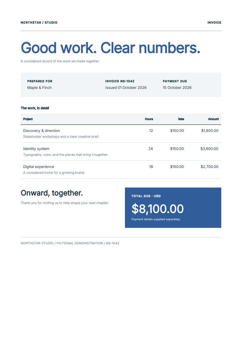
Invoice · One A4 page
One document combines a customer field, a table with formatted columns and a total panel. Its blue brand values come from the document theme.
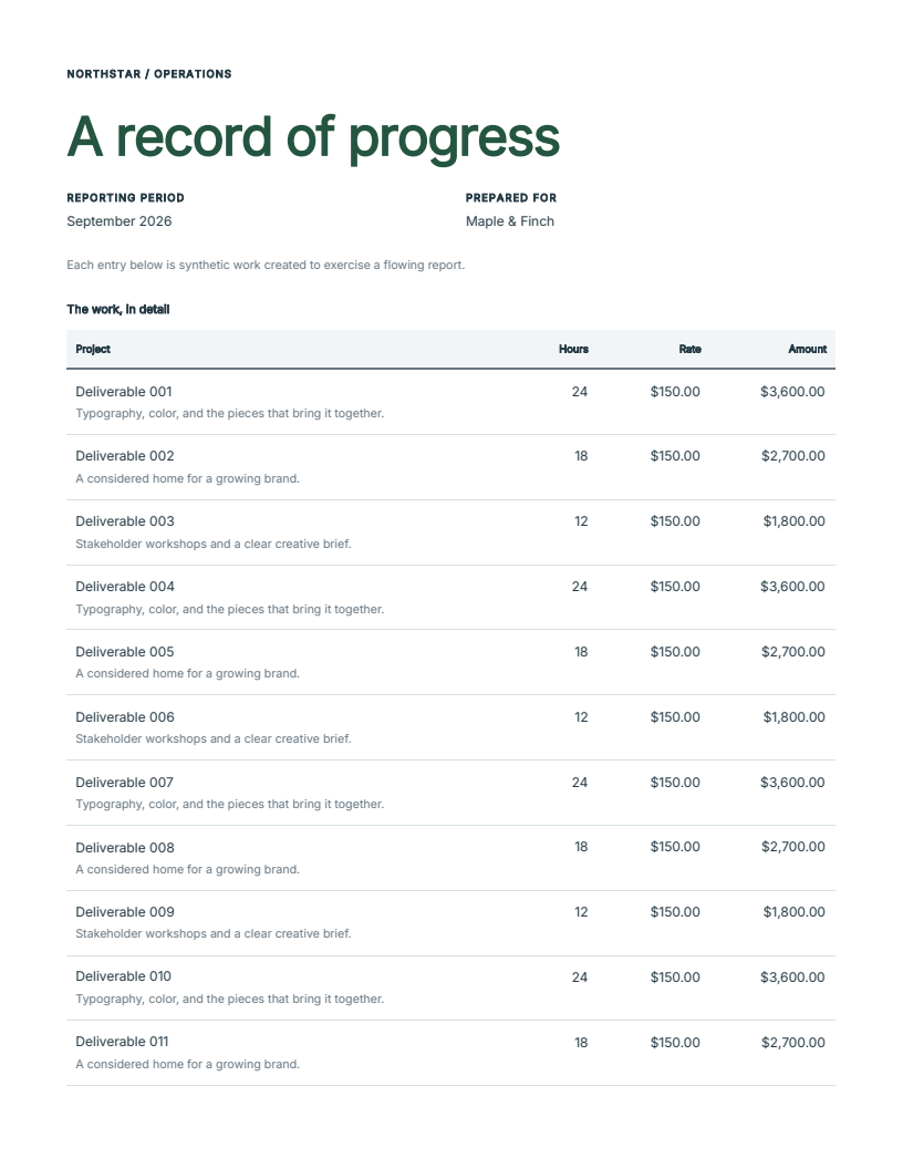
Operations report · Five Letter pages
The report changes the theme and supplies 60 records to the same table. Column headers repeat as the rows flow over five pages. The total panel reuses the invoice component with a root override and an advertised label-part override.
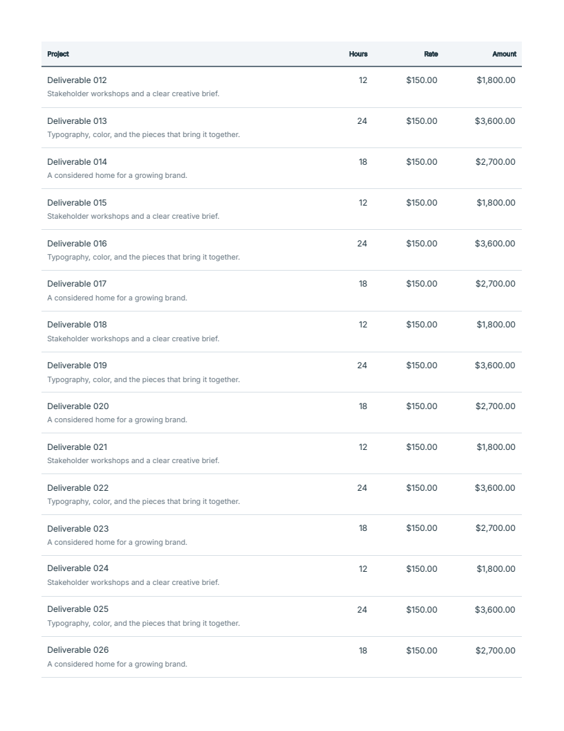
These images were rendered from the downloadable PDFs with PDFium. The artifact manifest records the source revision, candidate wheel, file hashes, page counts and verification scope.
A small component owns its appearance
Functions still take ordinary Python arguments. A style is an immutable value on the returned node; compilation collects it for the document:
from fullbleed.ui.experimental import Document, Paragraph, Stack, component, pt

@component
def Field(label: str, value: str):
    return Stack(
        Paragraph(label).with_style(font_size=pt(8), color="#667580"),
        Paragraph(value),
        gap=pt(4),
    )

customer = Field("Prepared for", "Maple & Finch")
highlighted = customer.with_style(background="#f2f5f8", padding=pt(12))
document = Document(highlighted)
Importing Field carries the label's styling into another document. The root
override returns a new node; customer keeps its original appearance. A function
does not have to accept and forward a style parameter to support that override.
For repeated defaults, the draft offers styled(...); for shared brand values,
Theme and tokens; for public internals, declared parts and .with_parts(...).
The runnable guide
introduces each separately, including font selection and PDF rendering.
class_name keeps its literal CSS meaning. It does not look up a Python variable
or load a stylesheet. The normal experimental workflow uses style values; the
established API remains available for selector-based CSS.
A column owns its header and cells
from fullbleed.ui.experimental import Column, DataTable, mm

table = DataTable(
    [{"name": "Design", "amount": "$120.00"}],
    columns=[
        Column("Work", lambda row: row["name"]),
        Column("Amount", lambda row: row["amount"], align="right", width=mm(30)),
    ],
    empty="No billable items.",
)
Adding a column changes one declaration containing its label, cell function,
alignment and width. Cells can return components. Applications still calculate
and format their values. DataTable supplies the table structure, empty state
and repeated column headers.
Try the source candidate
Building this preview requires Python 3.10 or later, Git, Rust/Cargo and the platform's native build tools. The source build uses the existing Rust engine; it is separate from installing the public wheel. Use an isolated environment.
git clone https://github.com/fullbleed-engine/fullbleed-official.git fullbleed-component-preview
cd fullbleed-component-preview
git checkout b22f159020b70b3239800c90e1ed3a9a1969b58f
python -m venv .venv
Then install the pinned checkout and render the example documents:
python -m pip install --no-deps .
python examples/component_recipes/main.py --output output/component-preview
Open output/component-preview/invoice.pdf and report.pdf. Edit
examples/component_recipes/kit.py to change shared components, or
documents.py to change a document's composition. No browser is used to produce
the PDFs. The preview's package metadata still says 2.5.25; the source revision,
rather than that version alone, identifies this experimental build.
What needs review
The draft has rendered-output checks, but independent usability feedback is still needed. Try an ordinary editing task: reuse a field in another document, change the brand, add a table column, change the paper size, or diagnose content that does not fit. Report where you needed an internal selector, generated HTML or an undocumented behavior. A small input and the expected layout are useful.
The current limits matter when evaluating the design:
- Oversized top-aligned text cells can continue, but rowspans, page-tall cell images and oversized cells with other vertical alignments need further work.
- Native pagination errors identify authored component scopes. They do not yet locate every failing descendant, row or cell.
- Token and part names are checked at runtime; their editor completion is unfinished.
- Rendering uses an extra pagination preflight pass. Its performance and future reuse policy are not yet qualified.
- Semantic validation integration and final delivery-profile verification remain separate work. These examples do not establish accessibility conformance.
Existing documents can try one new component through the explicit to_legacy
adapter described in the runnable guide. This does not deprecate the established
API or promise equivalent experimental interfaces in other languages.