Bootstrap components, authored in Python
Build an order summary with a card, a data table and a status badge. Export it as HTML or render it as a PDF. The component supplies its structure and default styling; your Python supplies the content.
Opt-in alpha 2.6.0a1
This guide uses Fullbleed 2.6.0a1, with experimental APIs under
fullbleed.ui.experimental. Install the alpha explicitly; a normal stable
installation does not select it. Names and behavior may change. Use the
released component guide for the stable API.
Download the Bootstrap kit Open the report PDF Browse the HTML catalog
All Bootstrap components are static, including HTML export. There is no Bootstrap JavaScript. Tabs show the selected panel, carousels show the selected item, and overlays appear in document flow. Ordinary HTML form controls retain their native browser behavior; PDF controls show printed values and selections.
A production report in components
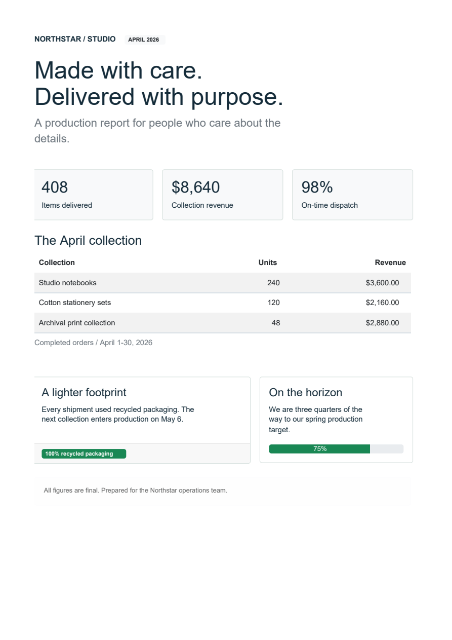
Northstar production report · One A4 page
Grid columns, metric cards, formatted table columns, badges and a progress bar compose a single document. Its content is fictional. The kit includes the complete Python source, and this image is rendered from the downloadable PDF with PDFium.
Install the alpha
Extract the kit ZIP, enter its
fullbleed-bootstrap-alpha folder and create an isolated environment with
CPython 3.10 or later:
Activate it with .venv\Scripts\Activate.ps1 in Windows PowerShell, or
source .venv/bin/activate on macOS/Linux. Then run:
python -m pip install --pre "fullbleed==2.6.0a1"
python first_document.py
python examples/component_bootstrap/main.py --out output --catalog-pdfs
Open order.pdf and order.html, then output/report.pdf and
output/catalog.html. The kit's requirements.txt pins the same alpha version.
Compatible Windows, macOS and Linux wheels need no Rust build. On other platforms,
pip may build the source distribution, which needs Rust/Cargo and native build tools.
See the alpha release.
The older pinned preview kit and
GitHub preview
remain available at 41a2cee. Those downloads retain their original source,
installer and version metadata. The alpha adds required/optional part declarations
and explicit child-part forwarding.
Compose content, then choose an output
The first example uses no HTML strings. Card owns its heading, body, header
and footer; DataTable owns the table structure. Each Column defines a header
and a function that reads a row. Save this as first_document.py:
from pathlib import Path
from fullbleed.ui.experimental import Document, style
from fullbleed.ui.experimental import bootstrap as bs

rows = [{"item": "Studio notebook", "quantity": 24, "amount": "$360.00"}]
card = bs.Card(
    bs.DataTable(
        rows,
        columns=[
            bs.Column("Item", lambda row: row["item"]),
            bs.Column("Quantity", lambda row: row["quantity"], align="right"),
            bs.Column("Amount", lambda row: row["amount"], align="right"),
        ],
        striped=True,
    ),
    title="Ready to ship",
    header="ORDER / 1048",
    footer=bs.Badge("Approved", variant="success"),
    class_name="mb-3",
).with_parts(title=style(color="#205b47"))

document = Document(card, title="Order summary")
Path("order.html").write_text(document.to_html(include_styles=True), encoding="utf-8", newline="\n")
Path("order.unstyled.html").write_text(document.to_html(include_styles=False), encoding="utf-8", newline="\n")
That block runs by itself and writes both HTML files. Add this to render a PDF
with the bundled Inter font; the downloadable first_document.py includes both
blocks:
from importlib.resources import files
from fullbleed.ui.experimental import Renderer, Theme, pt

document = Document(card, title="Order summary", theme=Theme(text=style(font_family="Inter", font_size=pt(11))))
font = files("fullbleed_assets").joinpath("fonts/Inter-Variable.ttf")
renderer = Renderer(font_files=[str(font)], document_timestamp="2026-04-30T00:00:00Z")
Path("order.pdf").write_bytes(document.render_pdf(renderer))
Ordinary Python functions, conditions, lists and generators compose components.
Strings become escaped text. Components are immutable values; methods such as
.with_style(...) return a changed copy. The optional @component decorator
gives diagnostics a useful component name and source location.
How class_name applies styling
The Python spelling is class_name. It labels the generated element with
literal CSS classes. It does not look up a Python variable or search for CSS
files. Bootstrap components carry the pinned Bootstrap stylesheet with them,
and a document collects that dependency once.
| What you want | Use |
|---|---|
| A supported component variation | bs.Badge("Paid", variant="success", pill=True) |
| An existing Bootstrap utility | class_name="mb-3 text-secondary" |
| Checked utility names and breakpoints | class_name=bs.utilities(p=3, mt={"md": 2}) |
| An explicit style on one root element | style=style(border_color="#b8cec4") or .with_style(...) |
| A card's title or body appearance | .with_parts(title=style(...), body=style(...)) |
| A custom CSS class | A literal class_name plus a rule in Document(styles=...) |
For a custom class, connect the label and rule explicitly:
note = bs.Alert("Please retain this copy.", class_name="order-note")
styled_document = Document(
    note,
    styles={".order-note": style(color="#304f45", border_color="#b8cec4")},
)
Path("custom-class.html").write_text(styled_document.to_html(include_styles=True), encoding="utf-8", newline="\n")
Normal CSS specificity applies. Bootstrap utilities using !important can
override normal inline declarations; avoid assigning conflicting values through
both. bs.classes(...) combines literal strings, ordered collections and
conditional mappings. bs.utilities(...) checks names against the actual 5.0.0
compiled stylesheet, including supported breakpoint variants.
Cards expose header, body, title, subtitle and footer as style parts.
Changing a card's title part affects its own heading, preserving nested cards'
headings. Optional sections stay absent until you provide content. For manual
structure, use Card(body=False) with CardBody, CardTitle and the other
section components.
Custom components declare required targets with parts=(...) and conditional
targets with optional_parts=(...). A parent exposes a selected child part with
.forward_parts(heading="label"). Missing required targets produce a diagnostic
when the component is created; child implementation details stay private. The
part-styling guide
shows reusable components and forwarding through containers.
Export whole documents or fragments
| Call | Result |
|---|---|
document.to_html(include_styles=True) |
Complete HTML with collected CSS in the head |
document.to_html(include_styles=False) |
HTML without generated or inline styles; class names remain |
card.to_html(include_styles=True) |
A component fragment with its CSS |
card.to_html(include_styles=False) |
An unstyled component fragment |
document.to_html() and document.to_css() |
Separate markup and CSS, preserving the existing API |
Styled export embeds CSS, not font or image files. Provide asset URLs appropriate to your web application. HTML export does not create a PDF renderer; it still requires the installed Fullbleed distribution. The alpha is not a separate HTML-only package.
Bootstrap CSS includes global reset and typography rules. A styled Bootstrap
fragment brings those rules into the host page. If your application already
loads its stylesheet, export the fragment with include_styles=False and let
the application's CSS apply to the retained class names.
render_pdf, prepare and render_image_pages automatically choose the static
print representation. Use document.compile(target="pdf") to inspect that
source, or target="html" for ordinary HTML controls.
Explore the component catalog
The HTML catalog shows all 23
Bootstrap 5.0.0 component families, plus four groups for layout, forms, content
and utilities. The source is in examples/component_bootstrap/catalog.py.
| Area | Included families and helpers |
|---|---|
| Content and status | Alerts, badges, cards, list groups, progress, static spinners, toasts |
| Navigation | Breadcrumbs, navs/tabs, navbar, pagination, static scrollspy |
| Grouped state | Accordion, collapse, carousel |
| Actions and overlays | Buttons, button groups, close button, dropdowns, modal, offcanvas, popovers, tooltips |
| Layout and content | Containers, rows/columns, gutters, headings, images/figures, tables, ratios, visually hidden helper |
| Forms | Inputs, textareas, selects, checks/radios/switches, ranges, input groups, floating labels and feedback |
Group helpers derive child IDs from a single group ID and optional item keys.
Set active, open, value, checked and selected options to author the
state. Hidden panels remain hidden in unstyled HTML.
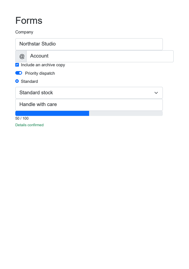
PDF controls print values and selections, including masked passwords and selected options. They do not become fillable PDF fields. Compare the form PDF and form preview with the HTML catalog.
What has been checked
The source implementation has focused tests for the component and export contracts. Its native catalog contains 27 one-page specimens; a separate 80-row table checks pagination and repeated headers. Browser checks exercise authored states and styled/unstyled HTML at desktop and mobile widths. The download manifest pins source files and wheel hashes. The output verification record records the published documents and checks.
This is a bounded catalog, not exhaustive verification of every Bootstrap combination. Interactive Bootstrap behavior, Sass compilation, browser pixel parity and accessibility conformance are outside this alpha. PDF layout uses the engine's print-media/page-width behavior. JavaScript and C# authoring APIs do not yet include this Bootstrap kit.
Try adding a column, rebranding a card or changing a selected state before reading the implementation. If a task requires generated HTML or an internal selector, that is useful feedback for the API design.
Share an editing task in the design discussion Read the complete API guide · Read the implementation review · Review the draft PR